From prototype to product in two weeks
Client
Valvur App · Case Study
Year
2025
The product was recognized by the UNESCO International Research Centre on AI (IRC AI), making it onto their global list of AI-focused education initiatives.
Product: A gamified platform that combines household chores and cybersecurity education, making learning fun and rewarding for children.
Problem: Kids skip chores and ignore cybersecurity habits. Parents have no tool that handles both. Traditional approaches don't work: security lessons feel like lectures, and chore apps lose kids' attention in days.
Cause: Traditional educational approaches are ineffective—security lessons feel like lectures, and chore systems lack engagement. Kids need motivation beyond reminders.
Solution: A gamified learning app built around mechanics kids already know from mobile games. Quests, rewards, leaderboards, customizable characters. Two separate interfaces: a dark, game-like world for kids and a clean, minimal dashboard for parents.
My role: Sole product designer. Owned UX/UI, visual design language, information architecture, and gamification strategy. Worked alongside 2 developers, with decisions validated in daily brainstorming sessions. This is the consumer product of Valvur, the same company whose internal team platform I built (see Valvur Platform).
Scope of Work


Time to Speed Up
If you've never had a startup that had just a few weeks to go from idea to execution, then you haven't worked with startups long enough.
A previous team had built a minimal viable version. Basic screens, functional backend, makeshift design. Think "Passport.Client" with a hamburger menu and a lot of good intentions. It definitely had its charm.
The product needed more than a visual refresh. The original plan was a mobile web version, but the project pivoted to a native-feeling mobile app. The structure, navigation, engagement mechanics, and visual identity all needed rethinking. And we had two weeks before the investor pitch.

Why every constraint helped
Two weeks sounds tight, and it was. But constraints forced better decisions.
The audience constraint: kids on hand-me-down phones.
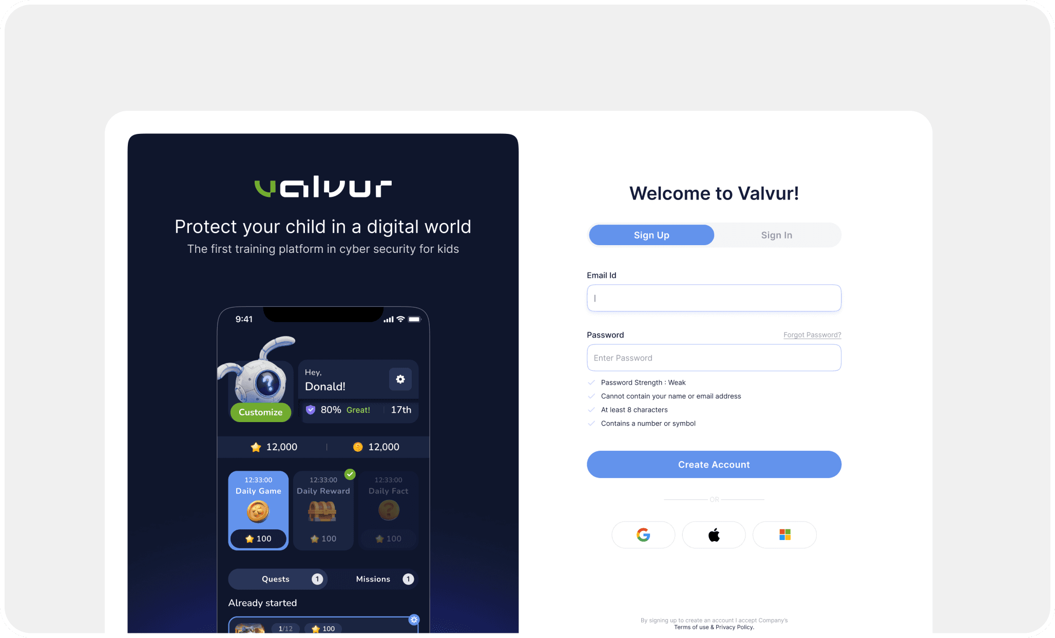
Many children use older devices inherited from parents. Small screens, slow processors. We made the design fully responsive and removed the bottom navigation bar entirely. Instead, the main screen works as a hub: daily game, daily reward, daily fact, quests, and missions are all accessible without navigating away. One screen does the job of five.
The safety constraint: we're teaching cybersecurity, so we can't be hypocrites.
Child profile photos are a privacy risk. We replaced them with customizable mascots. Kids got a character they could personalize (engagement win), and we eliminated the need to store children's photos (safety win). One decision, two problems solved.
The engagement constraint: it has to feel like a game, not homework.
We studied what formats already work for this age group. Clicker games stood out: simple mechanics, instant feedback, browser-compatible, and familiar to anyone who's played Cookie Clicker or its descendants. We built the core interaction loop around that pattern: tap, earn, level up, compete.
The investor constraint: some features didn't exist yet.
We were honest about this with ourselves. Several flows were designed as "future potential" screens for the pitch deck. They showed where the product was heading, not where it was. After the pitch, we stripped them out and focused on what was real.

Two apps, two worlds
The biggest design decision: kids and parents get completely different experiences.
The kid's app is dark, colorful, futuristic. Large tap targets, animated mascots, progress bars, leaderboards. It looks like a game because it is one. Cybersecurity lessons are disguised as quests. Chores assigned by parents appear as missions with real rewards.
The parent's app is the opposite. Light theme, clean layout, minimal chrome. Task assignment, progress tracking, reward management, chat with the child. No gamification, no noise. Parents need control and clarity, not entertainment.
We kept one design system underneath both (shared components, shared color tokens for status states), but the surface-level experience is deliberately split. Kids never see the "boring" version. Parents never have to navigate the game.
The result
The design was finalized in two weeks. Three weeks later, the test version shipped. The product passed its investor pitch successfully, and Valvur moved into formalizing the investment and planning the alpha release.
What I'd measure next: daily active usage among kids (are they opening the app without being reminded?), quest completion rate (are the gamification mechanics actually working?), and parent engagement (are they assigning tasks or abandoning the app after setup?). The alpha version will answer these questions.
What I'd change: the "Coming Soon" banners we used during the pitch phase turned out to be useful signal collectors, just like in our other project. Next time, I'd build them in from the start as a lightweight way to gauge interest before committing to development.


Happy end
The product was released in a test version another three weeks after the design process was finalized. And successfully passed the pitching process.
Now the product is in the stage of formalizing the collected investments and developing a plan for an alpha version

